
|
|
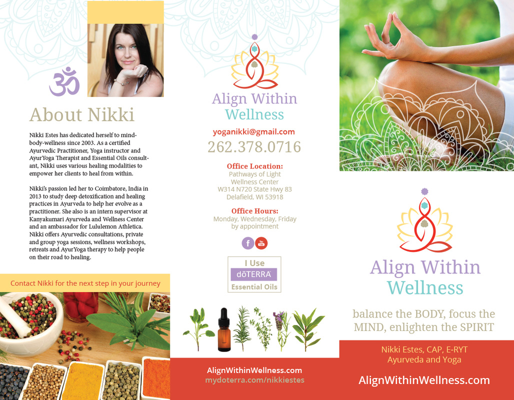
Today I am talking about a particularly exciting project I have been working on for my long-time yoga teacher and mentor Nikki Estes. We've known each other for almost 10 years now? Hard to believe. When I first met Nikki I was working full-time as an art director for an advertising agency. Now I run my own business and can take Nikki's classes whenever I want. I am a particular fan of her Friday class held in a wonderful space in Delafield called Pathways of Light Wellness Center. Class is held in wonderful cathedral ceilinged room with sky lights and a cozy fireplace. Its the perfect environment for letting the outside slip away and turning your thoughts to practice. A few weeks ago Nikki and I began talking about doing her web site. I started by giving her a few preliminary layouts to choose from. Nikki is a savvy business owner and once she saw her web site, she realized the rest of her materials needed to co-ordinate with her web site. That led creating a logo, brochure and business cards to accompany her site. The collateral pieces are done and should soon be found at Pathways of Light and Santosha Fitness. We're still working on the web site but I anticipate very soon it will be live. Namaste   
0 Comments
Who loves logos. Well finally, after umpteen years as a designer, I actually like them. Nay, enjoy them! I think it just all clicked. I started to see them as opportunities to really flex those creative muscles. And now I relish them. I can't take all the credit though. It was Phil at Cultivate Heritage who gave me one logo after another to produce. Nothing like trial by fire. I had no time to sit around and ponder the deep existence of the logo universe. We needed some designs and tout suite! Those clients wait for no one. ha. Today I have been working on a real estate property. Locale unknown. I have lots of experience with real estate logos from my job as an art director at Image Makers advertising. However that was in the early 2000s. Times have changed. Design has moved on. I wanted to do modern looking designs, not the same old thing you see with properties everywhere. Let's face it. We all know that look that property logos have. Script typeface. Often brush stroke based. Words with lots of kerning in them. yah. You know what I mean. Here are the lovelies so far. 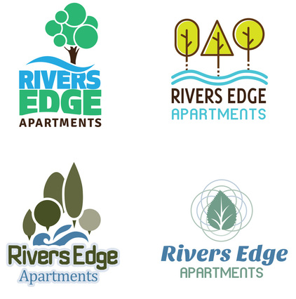 If I had to pick anyone these days to work with, it would be Phil. He is a great collaborator and I send art to him in total trust. He makes changes I love and we can bounce ideas back and forth with ease. Truly great to work with such a professional designer. :-)
|

Things we likeGraphic designer, ghost hunter, yoga lover, and sci fi enthusiast. Archives
March 2016
Categories
All
|


 RSS Feed
